Saturday, March 16, 2013

Dramatic graphic on the decline of teen driving. This trend saves fuel AND lives

 
I have had a couple of posts recently regarding the decline of fuel demand in the US and one of the contributors is a decline in the desire of today's teen to get a drivers license.  Just saw this graphic today in the LA Times that accompanies an article about this trend:

Source: LA Times
In the 16 to 19 year old  range that is quite a dramatic decline.   According to data from the Federal Highway Agency, there were 9.1 million 16 to 19 year olds with drivers licences in 2010 and 11.2 million in 1983. That is a decrease of 2.1 million 16  to 19 year olds on the roads of America in the last 30 years.
 
I was curious as to how this downward trend might affect traffic deaths in this age range over this same time period.  I found this graph:

Source: HERE

Seems like evidence that the decrease in the number of teen drivers is the contributing factor in the decline in teen traffic deaths.

In doing cursory research (meaning just google searches) most government agencies cite many reasons for the decline in teen traffic accidents. Most often they take credit for various initiatives they have undertaken to educate teens on the dangers of driving or additional laws and enforcement.

Maybe. But maybe not.  Perhaps cultural changes are more influential, as the article suggests.

Maybe is is just the emergence of the Smartphone.  Needs fewer oil changes, I suppose.


See here how Google gets its employees to make healthier eating choices without the heavy hand of force. Are you listening NYC Mayor Bloomberg?

Below is an except from a recent article in the NYTIMES on Google's corporate work structure, or lack of it.  This passage I found interesting (HT: Marginal Revolution for the prompt) because it employs behavioral economics to "nudge" people, of their own free will, to a desired outcome. 
"...In keeping with a company built on information, this seeming spontaneity is anything but. Everything has been researched and is backed by data. In one of the open kitchen areas, Dr. Welle pointed to an array of free food, snacks, candy and beverages. “The healthy choices are front-loaded,” he said. “We’re not trying to be mom and dad. Coercion doesn’t work. The choices are there. But we care about our employees’ health, and our research shows that if people cognitively engage with food, they make better choices.”
So the candy (M&Ms, plain and peanut; TCHO brand luxury chocolate bars, chewing gum, Life Savers) is in opaque ceramic jars that sport prominent nutritional labels. Healthier snacks (almonds, peanuts, dried kiwi and dried banana chips) are in transparent glass jars. In coolers, sodas are concealed behind translucent glass. A variety of waters and juices are immediately visible. “Our research shows that people consume 40 percent more water if that’s the first thing they see,” Dr. Welle said. (Note to Mayor Bloomberg: Perhaps New York City should hide supersize sodas rather than ban them.)..."---NYTIMES
 
Google is employing a technique called "Choice Architecture" as developed by Economists Cass Sunstein and Richard Thaler in their book "Nudge: Improving Decisions about Health, Wealth, and Happiness
Choice architecture describes the way in which decisions are influenced by how the choices are presented. It is in arranging the choice architecture in a certain way that individuals can be nudged in a certain way without taking away their freedom of choice. A simple example of a nudge would be placing healthy foods in a school cafeteria at eye level, while putting less healthy junk food in harder to reach places. Individuals are not prevented from eating whatever they want, but the arranging of the food choices in that way has the effect of decreasing consumption of junk food and increasing consumption of healthier foods.---Wikipedia
.Re-read the initial passage.  Recognize the concept?

There are ways to get people to do what you would like them to do without force, real or perceived.

This kind of thinking could help create better policies and more cooperation.

This is a GREAT example of how COOL Economics can be (is).  :)

Demand for gasoline is down and fuel efficiency is way up. Who gets the credit? See the answer here...

I may be suffering from a mild case of the "correlation is causation" fallacy, but the other day I posted the second graph you see below and suggested fuel efficiency was one of the factors in "demand destruction" of fuel consumption in the US. 

Today, I saw this graphic posted at Quartz that shows the change in fuel efficiency in Miles Per Gallon (MPG) change for cars and trucks over the last 35 years.  After a 20 year decline in efficiency from 1985 to 2005, efficiency shot up (yellow highlight).

Which auto manufacturers are leading the charge in making fuel efficient vehicles?  Scroll down, I will meet you there....
Source: Quartz


Surprised?  Probably not.  The first 7 out of the 11 listed are "foreign" manufacturers (not that there is anything wrong with that!).  They all have a significant manufacturing presence in the US, so it is all good.  :)

automaker fuel economy

Friday, March 15, 2013

Update on Manufacturing to Employment Ratio. Production has recoverd with 1.5 million fewer workers. This defines the New Economy in a nutshell. See important graphs here.

Mark Perry at AEI has this first graph touting the recovery of manufacturing output to pre-recession levels.  He graphs the recovery in Durable Good Manufacturing (things designed to last 3 years and up) in RED and motor vehicles and parts in BLUE.

ip

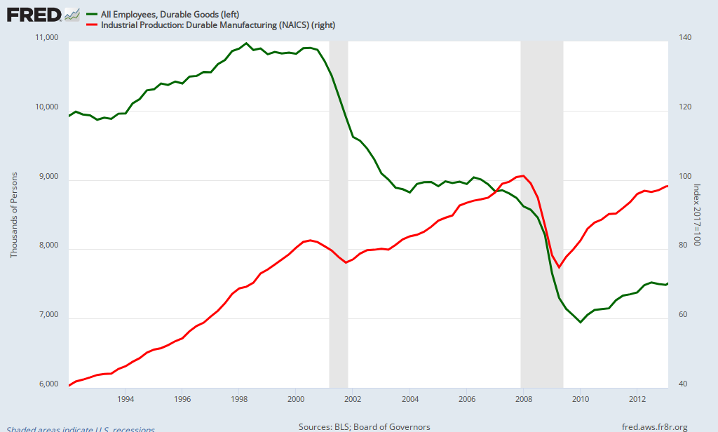
I wanted to see how this good new translated into employment in manufacturing.  Using the graph maker from the St Louis Federal Reserve, I duplicated only the Industrial Production: Durable Manufacturing line from the graph above (RED) and I added employment in that sector (both since 1992) in GREEN.

There is definitely a change in the output-to-employment ratio in US manufacturing, post-2000.  Output trends upward, as you can see going back to 1992, but employment trends DOWN dramatically after 2000 and never recovers fully even to post 2007 "Great Recession". 

So, output has recovered with about 1.5 million FEWER workers (eyeballing the tip of the GREEN line is about 7.5 million.  Pre-recession about 9 million were employed)

FRED Graph

Wednesday, March 13, 2013

Nice graph that shows the leveling off of fuel consumption for the foreseable future in the US. How can this possibly happen?

Americans are using less fossil-based fuel than prior to the "Great Recession" and it looks like it is going to continue based on projections from the US Energy Information Agency (USEIA). 

Reasons I can think of off the top of my head:  Persistently high gas prices over the last few years have "nudged" people to trade up (down?) to more fuel efficient vehicles, baby boomers retiring and hence tend to consume less fuel, a trend in teenagers waiting until they are 18 to get drivers licenses AND they tend to drive less relative to teenagers in the past.

I want to include the idleness created by the recession as a reason for a decrease in consumption, which is certainly part of the equation, but that does not explain the projection that consumption will stay level for some time to come.  Surely the economy will recover and fuel consumption  will increase on a per person basis.

How would YOU explain the long(er) term trend in less consumption of various fuels ? (for planes, trains and automobiles et al)
Source: Fiscal Times

Tuesday, March 12, 2013

Personal Reflection: How come ALL teachers don't chapperone events at school? It is a mystery to me...

The popular Freakonomics blog has a posting today regarding the best way for schools to get teachers to chapperone dances/proms and such.

I was always perplexed as to why ALL teachers would not want to pull this duty, or any other duty where a large number of students congregate.  There is NO BETTER way for a teacher who is not a coach or sponsor of a major activity to get themselves known to a broad swath of students---the ones they teach and the ones they don't.

It pays dividends (not cash, but intangible benefits more valuable than money) in the classroom, in the hallway, recruiting for your classes, et cetera when students know who you are AND they KNOW you care enough to attend their events.

Opportunity Costs---give up a little time now and again and earn some "street cred" with students.  This should not be seen as an imposition but an investment.  I cannot count the number of potential negative encounters that have turned positive because of a little recognition and respect the student showed to me.

Plus, why would a teacher NOT want to see students in a controlled environment OUTSIDE of school?  You would be amazed at the postive things you can learn about them, if you observe.

Young teachers take heed.  The best advice I can give you is to attend, attend, attend, as many events as you are able. Not just sports but the all the other "minor"(minor  in scope, not in impact) activities.

 Your teaching experience will be so much better for it.

More evidence that the Federal Budget is about Health Care spending and not much else.

How times have changed regarding the Federal Budget.  In 1960, 50% of the Federal budget was allocated to National Defense. In the 2010 budget it accounted for 19%. 

Like squeezing a balloon, virtually all of the difference has been a movement from Defense to Federal spending on Health Care programs. 

Source: Color coded pie charts copied from AEI but from a study by the Philadelphia Federal Reserve
To put this in perspective I will adjust for inflation and put 1960 spending in terms of what that means in today's dollars.  I think that will be helpful in understanding the scope of issue
Defense spending in 1960 dollars was $53 Billion dollars (source HERE). Adjusting for inflation, that would be equivalent to $390 billion in today's dollars. Actual Defense spending in 2010 was $872 Billion---a 2.25 fold increase OVER inflation.
Health care spending in 1960 was $1.5 Billion dollars (source HERE). Adjusting for inflation, that would be equivalent to $11 Billion in today's dollars. Actual Federal spending on health care in 2010 was $846 Billion----a 77 fold increase OVER inflation. YIKES!! But hold on...
 Caveat:  The Federal program Medicare did not kick in until 1965-66 time period so spending in 1960 on health care might be considered low.  Let's use 1970 for Federal health care spending and use that as the base.
Health care spending in 1970 was $12.1 Billion dollars. Adjusting for inflation, that would be equivalent to $68 billion today. Given health care spending in 2010 was $846 billion that would be a 12.5 fold increase over inflation.
Defense spending in 1970 was $95 billion. In today's dollars that is equivalent to $534 billion, Given actual Defense spending in 2010 was $872 billion, that is a 1.6 fold increase over inflation.
To be more accurate and relevant, the economist who wrote this report probably should have used a post-Medicare implementation time period to use as a base.  Given the realities of the Baby Boom generation, that would have been more helpful.


View My Stats